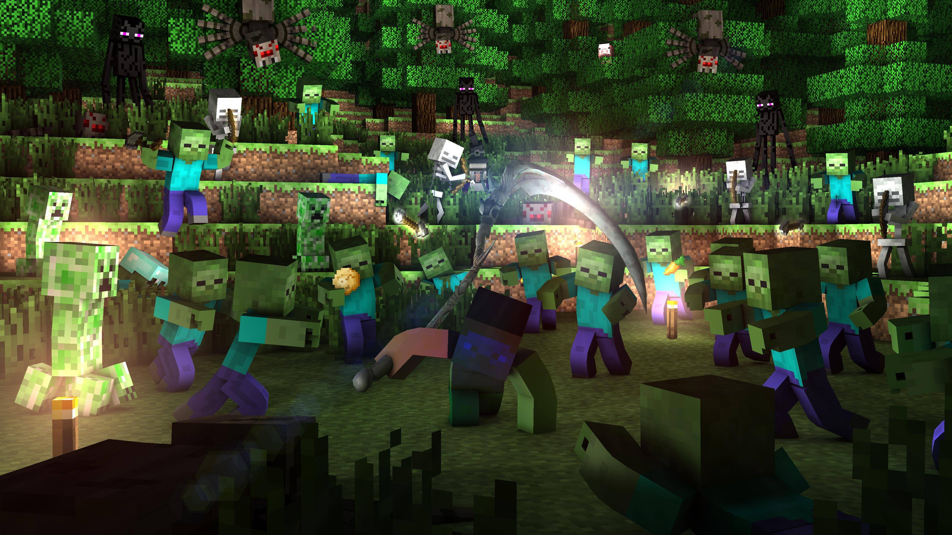
Yeah, so after about a year or so (I gave up on minecraft about 2 years ago) I said “Well, let’s make a wallpaper just for fun now that the schools are opening” So here it is:
The title"Osiris" is a working title, because I don’t know how people might take it. Will they think that a scythe has nothing to do with minecraft or that it is a very cool attachment to the game as a wallpaper? Well, I don’t know, so I ask you. If you believe it sucks, I can change the player holding a sword in another pose. If you think the whole scenery or wallpaper sucks, then I won’t even post it. Thanks for helping me
Thanks, I appreciate the compliment, but I would really like some further advancement suggestions, especially from a fellow wallpaper creator. Thanks for supporting me though
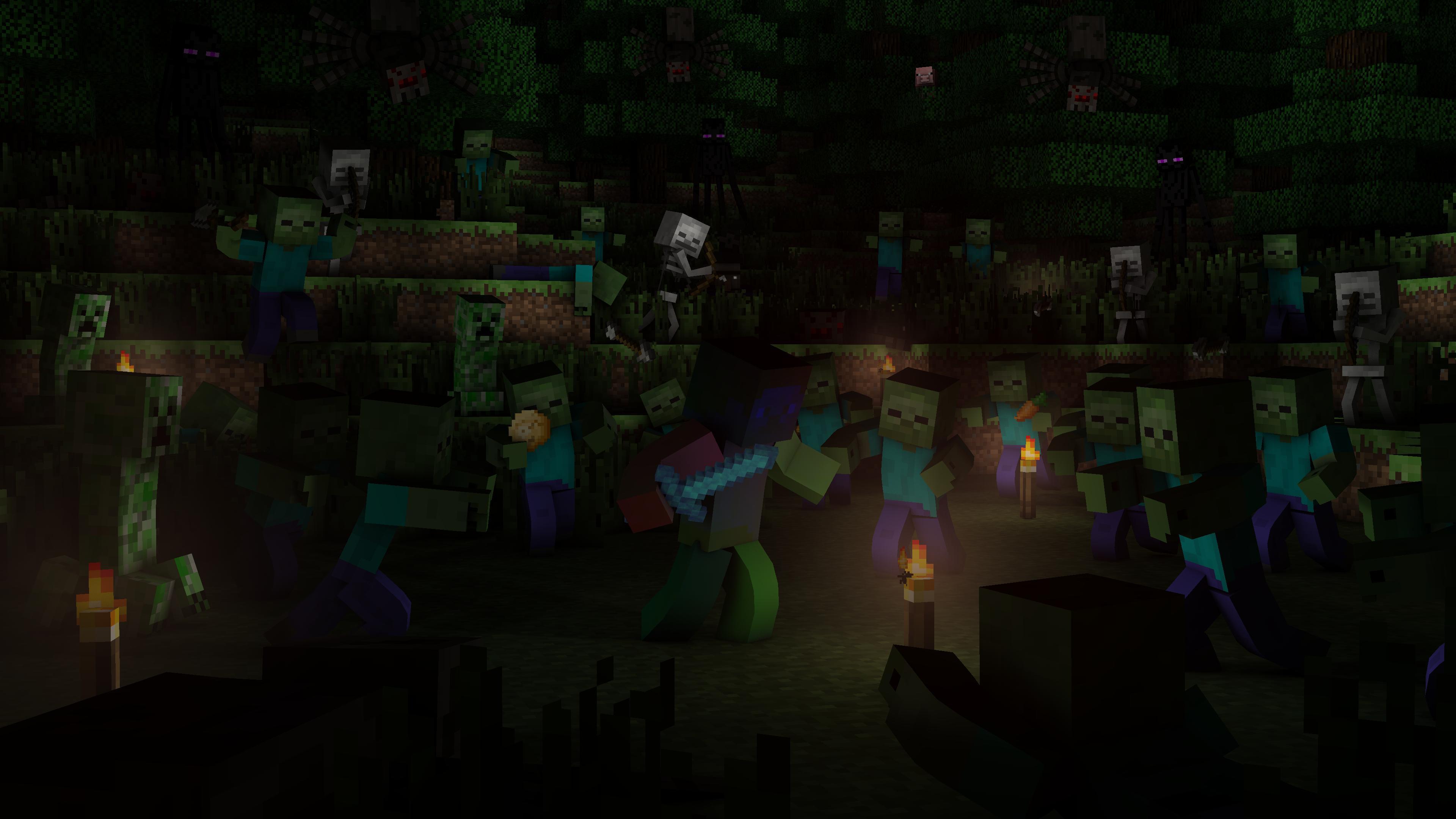
I do feel like the lighting in the front of the scene could be brighter. I
understand it’s suppose to be like in a forest with low light, but I feel
like it’s a little too dark.
In my opinion, you should never include other models in wallpapers. Not only does it clash with the artstyle, but it doesn’t make sense as a whole (Where did the player manage to find an object that mysteriously isn’t blocky? It’s also freaking huge, like he’s carrying around a streetlight or something)
I say the best course of action would be to model a scythe that wouldn’t look out of place in the actual game. One such way would be to make an item sprite, for instance take the iron hoe and lengthen it and extend the blade thingy.
As for the rest of the wallpaper, the lighting is a bit strange. The grass and trees are clearly well-lit in the background, which makes it seem like this wallpaper takes place during daytime, something it clearly doesn’t since there are mobs out.
I suggest changing the lighting so the light sources aren’t just coming from everywhere. And to get a better night-timey feel you could have the environmental lighting (or sky light, whatever your render engine is currently using) be a dark blue or purple, while changing the torches to be more of an orange-yellow color.
Also, you should use a self-emitting texture for the top part of the torch (the actual fire-y part), because right now it looks like a cardboard box that is lit from the other side:
Try to make it look more like this, where the fire part is clearly lit:
Oh, and remove the lens flare, it just looks tacky
Those torches are very faint. Looks like you didn’t set the top parts to be self-emitting.
You should be able to set an additional texture with an emission shader (self luminance, self emitting)
Here is an example of the torch texture, and the torch emission texture (which is the fire part surrounded by black, since black won’t give off any light)
Why is a self emitting texture important?
Well, suppose you’re using a lamp next to the torch to act as the lightsource coming from it. Without a self-emitting texture, you will see shadows appearing on the parts that should be lit, depending on where you place your lamp (more on that later), but if you also have the texture be self-emitting, it looks like one would expect from a torch.
A self emitting texture can work as a light source on its own, but you will probably need to amp the strength way up, something that makes the emitting part of the texture look overexposed, and lead to longer render times (depending on what render method you use)
This is why you need a lamp (something you’re probably already using), but if you don’t place the lamp dead center inside the torch, you will get shadows on one or more sides of the torch which, again, looks unexpected.
As for the rest of your wallpaper, there are still some unexplained bright spots, and the shadows seem to be nearly painted on (why is there a bright spot between the zombie, creeper and skeleton to the left?)
Your change made the wallpaper too dark overall, one look at the histogram and you can see most of the values are very dark.
You should really fix the torches in your wallpaper and make them look like real light sources instead of washed-out boxes.
Seems so. The light that you said doesnt maek any sense though (the one between the skeleton, creeper and teh zombie on the left) is another torch that seems hidden. About the emitting textures too, I didn’t want to add light on them or in teh center of teh torch, because then either weird shadows come out or are created in weird spots, or the light doesn’t come out at all because of the texture that there is “in front” of it. Well I also can’t add more light as you said, because that would make it seems liek daytime, but can’t either leave it like that, it seems too dark. Thus the night concept for this wallpaper is wrong.
With that said, the wallpaper won’t make any sense like the others. Might as well delete rather than just not sending it.
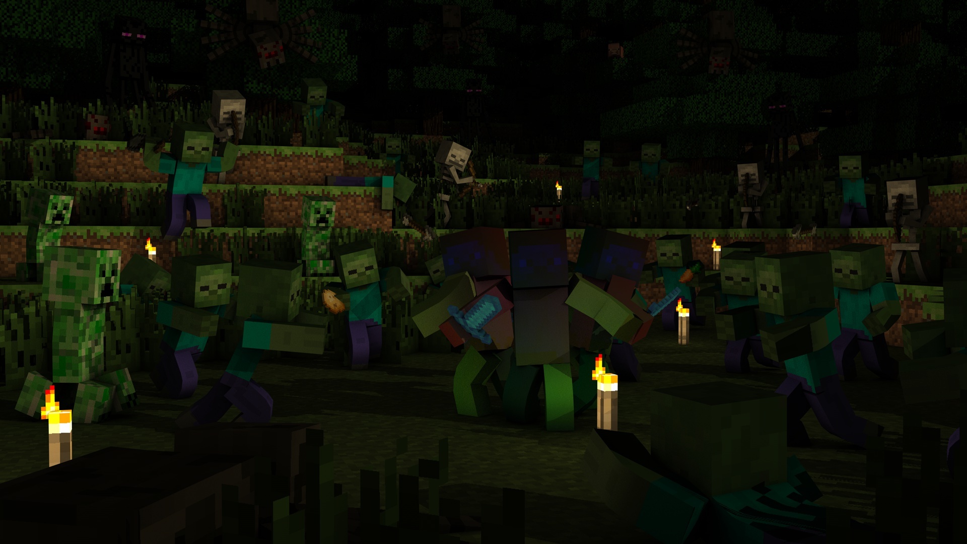
I think you should replace Sickle by a sword is kind of weird, also puts more players because are many monsters such and congratulations liked anyway = D
I’ve taken the liberty of adding lights and 2 additional players to the scene. Original Author @XG_PRO gave me permission to work on it. I hope this looks more what he was aiming for. Should it be uploaded?